Not to get too contemplative on a Monday morning or anything, but do you ever experience a particular moment that just makes you rethink your entire life? That’s pretty much where I’m at right now.
Well, maybe not my entire life, rather just my short (but developing) lifetime as a blogger. I’m kind of dramatic like that.
So how did I get so lost in thought this time around? School, I tell ya. Last week, I was lucky enough to sit in on a lecture by Mauve Pagé, a local designer. We talked about design principles, how to curate functional yet effective
JUST BROWSING?
I walked away from the lecture with a lot of food for thought. So much so, that gone are the days of mindless website wandering where I wasn’t thinking about the ratio of items to white space or colour/text/image contrasts. This even applies to my go-to domains. Domains like Bustle.
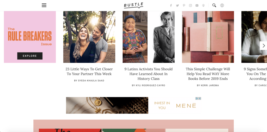
A recent addition to my daily routine, Bustle is an evolving, modern publisher that spews out stories from a wide range of categories—from features on badass women serving as leaders in their respective industries, to definitive lists of the best new products at Trader Joe’s. Aren’t you loving it? But before I get too fired up, let’s talk design.
One of the features which pulls me into the site, and admittedly keeps me there for longer than it should, is how visually pleasing it is. I love how the feature photos are vibrant, eye-catching, and the perfect contrast against a plain, white background. Not to forget, the duo of typefaces was also a smart choice—classy, legible, and simple. This combination creates a perfect situation for readers (like me!), where they come for the looks, but stay for the stories.
LOST AT C-PANEL
Sure, I’ll call myself out and say that another one of the websites that I visit on the daily, is this space right here, Moods & Mixtapes. This is where the existentialism hits full force. Suddenly I’m rethinking all of my design choices and how engaging and efficient the site is.
During the lecture, Mauve said something along the lines of, “waiting two seconds for a page to load, is two seconds too long”. That hits hard. So, have I been testing my speed? Yes. Have I been incredibly wary of inserting unnecessary content and huge images? Also yes.
But the latter is somewhat of a blessing in disguise. After all, caring about design is just as important as caring about the content. And as Travis Gertz artfully phrases it in “Design Machines: How to survive the digital apocalypse”, our sites should be more than “crap content selling crap”. Translation: substance shouldn’t come at the expense of style.
So stay tuned for next week folks, and let’s see what kind of facelift this existential mind can give this place.